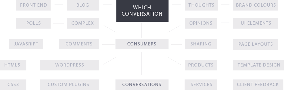
Contact

Which? Conversation

THE CHALLENGE

To engage with Which? magazine subscribers online using a comprehensive WordPress blog dealing with consumer issues. Conversation was released to the Which? community as a hub to share their thoughts and discuss how consumer issues affect their lives.

the challenge

THE RESEARCH

We collaborated with Which? to better understand their customers and the creative & business aims Which? had in setting up a consumer blog. The main design goal was to provide consumers with an easy to use discussion platform that had a clean and fluid user interface that could be updated with ease.

THE PROBLEM

THE PROBLEM

We identified the main areas of difficulty in creating an interactive blog and discussion platform for Which? in the areas of front-end and user interface design: the need for easily updateable and amendable content by admins, extensive interactive, real-time features and a 10 week turnaround time.

THE GOAL

THE GOAL

Our creative goal was to design and build a custom social hub for consumer discussion that fit the design brief, was fully tested and was created on time. We accomplished this goal by understanding end-user needs and embracing the Which? vision for their blog.

SEAMLESS INTEGRATION

SEAMLESS INTEGRATION

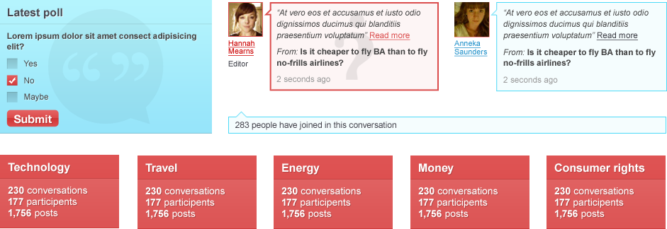
The function of the Which? blog was to allow consumers to discuss, interact, vote, share and ‘like’ – all on one speedily updated platform. We integrated this end-user need by developing a custom-built WordPress theme and a bright, simple and categorised user interface design.
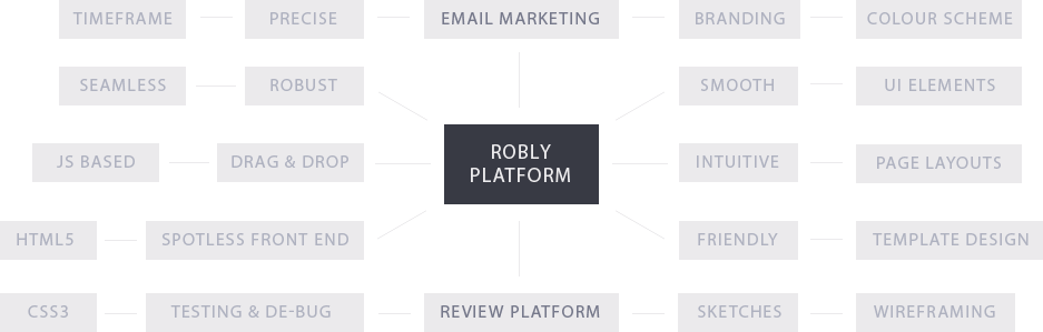
THE UI AND DESIGN

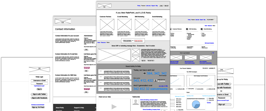
As always, we presented several wireframes to the client and thoroughly discussed and researched their design ideas for the Which? blog, allowing us to create clear and purposeful user flow patterns.

THE USER INTERFACE

the user interface

THE DESIGN

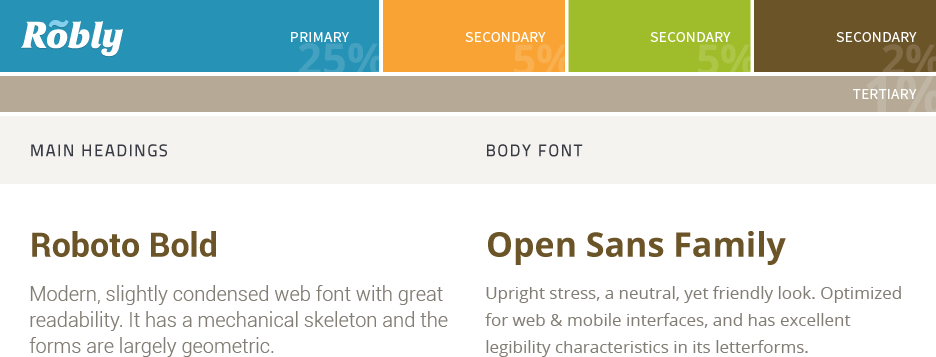
The custom-built WordPress theme had to incorporate statistics and comments for each blog post in the footer area of the website, along with author information and post lists in categories. The layout had to be easy for users to navigate and so we designed a blog with simplicity in mind; using teal, red and white colours throughout the website.

FRONT-END & JAVASCRIPT DEVELOPMENT

We used our super front-end development powers to effectively mix the programming and layout of the Which? blog to create a visually engaging website with a custom post voting system. Our end development goal was to build an easily maintainable admin system that allowed Which? to filter and manage posts and comments for approval to the blog.

  • 1,500

    lines of code

  • 8 weeks

    brief to launch

  • Five

    custom plugins

the launch

THE LAUNCH

Which? Conversation was launched in 2010.

The sheer number of people who share comments, thoughts and polls on the Conversation blog has created over 2,500 blog posts and generated over 60,000 comments. It’s a powerful consumer blogging platform that packs a heavy punch and still works seamlessly to this day.

Visit Which? Conversation

Click to read more

Robly

THE CHALLENGE

To create a visually stunning, friendly, intuitive and smooth interface for robly.com and
to develop a cutting-edge Javascript based email template
with a Drag and Drop editing tool.

the challenge

THE RESEARCH

We determined the core goals and problems that were associated with the project by thoroughly researching Robly’s business and end-user needs. Robly’s core mission was to provide a smooth email marketing tool as well as seamless integration with its customer review platform.

THE PROBLEM

THE PROBLEM

We established the main challenges that Robly.com would face when it came to design, front-end and Javascript development. These were: a tight deadline, a high innovation factor and the colossal scope of the project.

THE GOAL

THE GOAL

The goal was to launch the Robly.com website precisely to their specification list and ensure it was fully tested internally. We achieved this by performing excellent team communication and efficient time management.

SEAMLESS INTEGRATION

SEAMLESS INTEGRATION

Two of the core functionalities of Robly were that email marketing and reviews had to go hand-in-hand from an end-user perspective. We accomplished this by creating highly intuitive user interfaces.

THE BRAND, COLOURS & FONT CHOICES

We developed a brand, colour palette and determined the best font choices for the client based on their creative vision and target audience. The blue, orange, green and brown shades were chosen to differentiate between different actions users could perform.

THE BRAND

the brand

THE COLOUR PALETTE AND FONT CHOICES

the brand

THE WIREFRAMES

We began the creative process by presenting wireframes to the client. This allowed us to work comprehensively on user interactions and user flow patterns.

THE WIREFRAMES

OVER 29 WIREFRAMES WERE CREATED

THE UI, DESIGNS & SUPPORTING ELEMENTS

A whole bunch of icons and effects were created and tried out before finally being put forward to code. Many sprites and buttons that were tested we later found to be visually appealing on the interface.

THE USER INTERFACE

the user interface

We created over 600 individual UI elements that were used on the Robly website design. All elements needed to be pixel perfect, sharp, of uniform and inter-changeable sizes and colours. Each colour indicated the type of action to be taken: blue to save, green to move on, yellow for calls to action and brown for extras.

THE DESIGN

FRONT-END & JAVASCRIPT DEVELOPMENT

We worked extensively on HTML/CSS to ensure all code was standards compliant and utilised modern working approaches. We also had to manage class names and id’s to easily integrate them into the Ruby development.

  • 15,000

    lines of code

  • 6 months

    brief to launch

  • 100+ tasks

    in the brief

  • 90

    bugs fixed

  • 100+

    pages coded

  • 250+

    javascript snippets

the launch

THE LAUNCH

Pending launch date – August 2013

The Robly.com website is scheduled for launch to the public after a final round of external testing. Get ready for the next big thing in email marketing!

Visit the Robly Website

WHAT THE CLIENT SAID:

“Robly spent 14 months in development developing a platform that offered a suite of marketing products to small businesses and organizations. Different parts of the product were developed in New York, California, India, the UK, and Romania. We were connected with The House Media through our freelance UI/UX expert.

We hired them to do all of our HTML and CSS work for Robly, and contracted them to build a drag-and-drop email builder, both were stellar.

Every work product we received from The House Media was of the highest quality. They were also very realistic with forecasting and hit deadlines. All-in-all, it was a very positive experience, and I would recommend them to anyone.”

Adam Robinson, CEO

Click to read more

pBone

THE CHALLENGE

To build a visually appealing WordPress website with custom theme options for easy pBone product additions and changes, as well as a bespoke client and trade document download area.

the challenge

THE RESEARCH

We were briefed on pBone’s product and customer target market and built a colourful, bright and easy to navigate user interface that matched the look and feel of their product and brand.

THE PROBLEM

THE PROBLEM

Some of the challenges we identified with the pBone website were: very quick turnaround of 6 weeks for the website build and testing, and creating a custom WordPress theme that would allow website admins to manage product details, distribution details and purchasing details.

THE GOAL

THE GOAL

Our goal was to develop a smooth and stylish user interface within the tight deadline of the project, which was also fully tested and customised to suit pBone’s business needs. We accomplished this goal through research, communication and our effective development solutions.

SEAMLESS INTEGRATION

SEAMLESS INTEGRATION

Two main needs of the pBone website were to fully integrate a WordPress blog and social networking sites to create greater ease of use and a high level of functionality within the website. Our custom-built theme allowed for seamless integration within the fluid user interface.

RESPONSIVE APPROACH

An important element of the design brief was to develop a responsive web design that allowed the pBone website to be viewed on multiple platforms and devices. Part of pBone’s business needs was for customers to be able to access their website not only on desktops, but on tablets and smartphones, too.

DEVICES

DESKTOPS

DESKTOPS

The pBone desktop theme had to be full-size, colourful and clear with an easy to navigate user interface design and superior functionality.

TABLETS

TABLETS

We enabled the theme to responsively re-adjust the size and layout of the content for effective and comfortable viewing and use on tablet devices.

SMARTPHONES

SMARTPHONES

Although the screen of smartphones is a lot smaller than desktops and tablets, the pBone website is able to change size, position & shape when accessed on a smartphone.

RESPONSIVE THEME

FRONT-END, WORDPRESS & JAVASCRIPT DEVELOPMENT

The front-end and javascript elements we had to consider when making the pBone website were how to effectively integrate their blog and social media sites with easy to navigate headings and categories. Not only that, we had to develop a custom WordPress theme that was responsive and allowed for simple updating and management of content.

  • 50+ tasks

    in the brief

  • 8 weeks

    brief to launch

  • Responsive

    Layout design

the launch

THE LAUNCH

The pBone website was launched in May 2013.

The pBone product is sold internationally and the website we created is the social, business and informational hub of their operations. Consumers can easily access information about the famous pBone trombones online!

Visit the Pbone Website

what our clients said:

“We have worked closely with Steve and the team for the last 4 years. As a small branding agency we were in need of a programming arm that could closely match our designs and offer good value for money. We have not been disappointed – they are both patient and communicative when jobs move in different directions and they remain a key part of our business.”

Tim Worsley, co-founder Big Helping

Click to read more